DESIGN
CLASS WORK
 |
|---|
 |
 |
 |
BREWS AT
THE ZOO
Lincoln Children's Zoo
Brews at the Zoo Campaign Redesign
This spring, the Lincoln Children's Zoo asked our class to help with guerilla marketing tactics for their Brews at the Zoo event. Each student was asked to come up with their own tactics. A few elements I designed are in the gallery to the left. A coaster to be handed out at the breweries the zoo partners with. Another guerilla tactic was a beer-bottle "statue" in the Haymarket with a label containing all of the information for the event, including a specialized bottle cap. Lastly, I redesigned their website in order for a more cohesive user experience.
 |
|---|
 |
 |
 |
 |
FULL DECK
FULL DECK
Deck of Cards
In Graphic Design II, we were assigned a project in which we were to create a theme for a deck of cards. The requirements were: 4 front card designs, 1 back card design, and a rulebook. I chose to assign a drink recipe to each number, and to make a rulebook for a drinking game. To me, cards represent having fun and I wanted this deck to encourage the players to do just that!
 |
|---|
 |
 |
 |
POSTERS
In Graphic Design I, we were asked to create two different posters. The first poster was to pick a topic which we were passionate about, and design an influential poster about that. Although I am not a political person, this issue to me, is a moral issue. How is it that we are allowing one in six women to be victims of sexual assault? It needs to be stopped, and if this poster can persuade any change, then it is successful to me.
We were also asked to design a poster for the school of Art, Art History, & Design in order to attract other students to our school. I chose to represent Herbie Husker, a Nebraska icon, in pop art form. I felt as if both of these were something that non-art students could recognize and relate to.
 |  |  |
|---|---|---|
 |  |  |
LOGO
Logo Re-Design
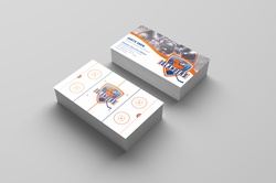
In Graphic Design I, we were asked to redesign an already established, yet bad logo. I have a passion for sports, and I found the New York Islanders', an NHL Team, logo to be horrendous, so I took the challenge. I decided to keep the same colors as the original team. After researching other NHL logos, I found that the most successful ones had a mascot of some sort featured, and something that relates to their team. I chose to place the hockey player front and center, with the Long Island skyline in the background. I also chose to have two versions of the logo: one with the name, and one without. This logo is versatile in application, making it a successful redesign.
Along with the logo are mockups of hockey jerseys, business cards, a schedule brochure, and a letterhead for corporate. I've also included a black and white version of the logo, with the name stripped as well.
 |  |  |
|---|
PUBLICATION
Publication Designs
Connection
If Marshall McLuhan wrote a sequel to The Medium is the Massage, what would it be about? Recently, I've noticed that most people complain about how technology has taken over our lives in a bad way. However, I say, embrace the connection. I believe McLuhan would talk about how technology is an extension of us and we are to embrace that connection. This is the book jacket I designed for said book.
Bon Voyage
Bon Voyage is a magazine I designed. It is compiled of articles about traveling around the world. Traveling is something I'm passionate about, however, it's also difficult to do so as a student. I wanted a magazine where students could go to find travel options for them.
Podcast Cover
We were asked to pick a podcast episode which we enjoyed, and to design a thumbnail for that specific episode. I chose Stuff Mom Never Told You's Where the F*** are the pockets on women's clothing.
LocalAnyDay
 |  |  |
|---|---|---|
 |
LocalAnyDay Work
Snapchat Filters
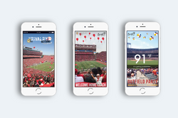
In order to promote our brand to a large number of people, we created Snapchat filters for those events! Above, you will see three of my designs!
The middle one was for the 2018 Spring Game where we introduced Scott Frost as our head football coach. It was a soaring success and was used 2700 times, which was a rate of 25.7%.
Digital Graphics
For some holidays, our marketing team would post on LocalAnyDay social media about that holiday. As a designer, I was asked to help create a series in accordance with our brand guide for each of those holidays. Above, you will see three of those graphics from Earth Day, Easter, and Mother's Day.
Capitol Flyer
In early 2018, we partnered with the Lincoln Chamber of Commerce. In order to promote our app, I designed a 5.5" x 8.5" flyer to give to the capitol employees. These were placed in break rooms and meeting rooms.
Like A Local Photo Series
One of our most recent campaigns was #LikeALocal. For our social media, I created a series of photos that showed the different types of activities and adventures our users can embark on through our app.
PERSONAL
 |
|---|
 |
 |
 |
PAINTING
Husker Greats Paintings
My mom found a sale on a pack of 20"x20" canvases at Michael's and surprised me with them. After some brainstorming, I figured the perfect addition to our basement would be paintings that honor Husker coaches who have made a huge impact. Scott Frost is our newest football coach and the whole state of Nebraska adores him. Although he does not have any championships yet at UNL, I believe he will. Tom Osborne is also another Nebraska legend who led us to 3/5 of our national championships. For the third painting, I chose John Cook who has led the Nebraska volleyball team to 4/5 of their national championships. These men are the faces of Nebraska, and it is an honor to have them on my basement wall.